Stencil spray-paint font with toggleable dripping effect
Spray Me, from developer Spray Me, is a stencil-style display font built to give text a spray-paint appearance for short-format designs. It renders textured, urban letterforms and supports on-the-fly decorative variation while typing, so designers can add gritty character without separate image work. The face emphasizes bold, high-impact letterforms suited to posters and headline use. Creatives seeking a ready-made street-style display face find a direct, type-first option here.
What the font contributes to gritty display typography
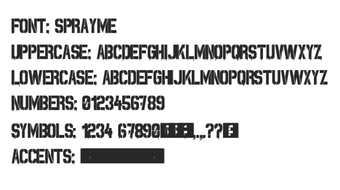
Spray Me reproduces the look of fresh spray paint through stencil letterforms that echo Impact, paired with irregular edges and surface texture to suggest overspray. The design emphasizes contrast and weight, so it suits short, attention-grabbing copy rather than running text. This approach answers the need for a street-art aesthetic inside type, avoiding the need to composite raster paint effects in a separate editor.
How much control you get over the paint effect
The font exposes a dynamic dripping effect that can be toggled via the Shift key, and many versions map lowercase keys to alternate 'dirty' letterforms. That behavior gives designers immediate stylistic variation while typing, making it possible to switch between cleaner stencils and heavily weathered letterforms without switching files or layers. Alternates and splatter glyphs are available inside the same installation.
How it fits into file and workflow requirements
The family distributes as standard TrueType/OpenType files compatible with Windows and macOS, so it installs into typical desktop design workflows. The character set includes roughly 90 glyphs and a dedicated spray-can dingbat, allowing quick access to decorative marks from the font palette. Built-in textures reduce dependency on external bitmap overlays when producing posters, apparel mockups, or logo treatments.
Which projects and contexts it suits best
Use cases include posters, military-themed displays, apparel graphics, and other short-form assets that benefit from an aggressive, urban look. The face originated in a stencil design competition on FontStruct, which shaped its emphasis on stencil cuts and surface blemish. Designers needing a single, type-centered way to inject graffiti-like texture into headlines will find it concentrated around that purpose.
A focused display face for gritty, short-form design
Spray Me is a targeted option for designers who need a spray-paint, stencil aesthetic for headlines and short graphics; its built-in alternates and glyphs let teams apply textured letterforms directly in text layers. Consideration: the family concentrates on bold, display use, so projects requiring neutral body typography or extensive language support should evaluate broader families alongside this one.